“#China has reported to WHO a cluster of #pneumonia cases —with no deaths— in Wuhan, Hubei Province 🇨🇳 . Investigations are underway to identify the cause of this illness.” This tweet sent out by the World Health Organization (WHO) one year ago broke the news of what was to become the defining global health challenge in 2020. Two and a half weeks later (21.01.2020) WHO started releasing regular situation reports of this previously unknown virus disease that was first reported to the organisation’s country office in China on 31st December 2019. First broadly referred to as Coronavirus, the outbreak was declared a Public Health Emergency of International Concern on 30 January. The disease is now called COVID-19 (transmitted through the SARS-CoV-2 virus) and has been characterised as a global pandemic on 11 March 2020 due to the ‘the alarming levels of spread and severity.’ One year after the (known) outbreak in China (as of 4 January 2021) there have been 83,910,386 confirmed cases of COVID-19 globally, including 1,839,660 deaths, which were reported to WHO.
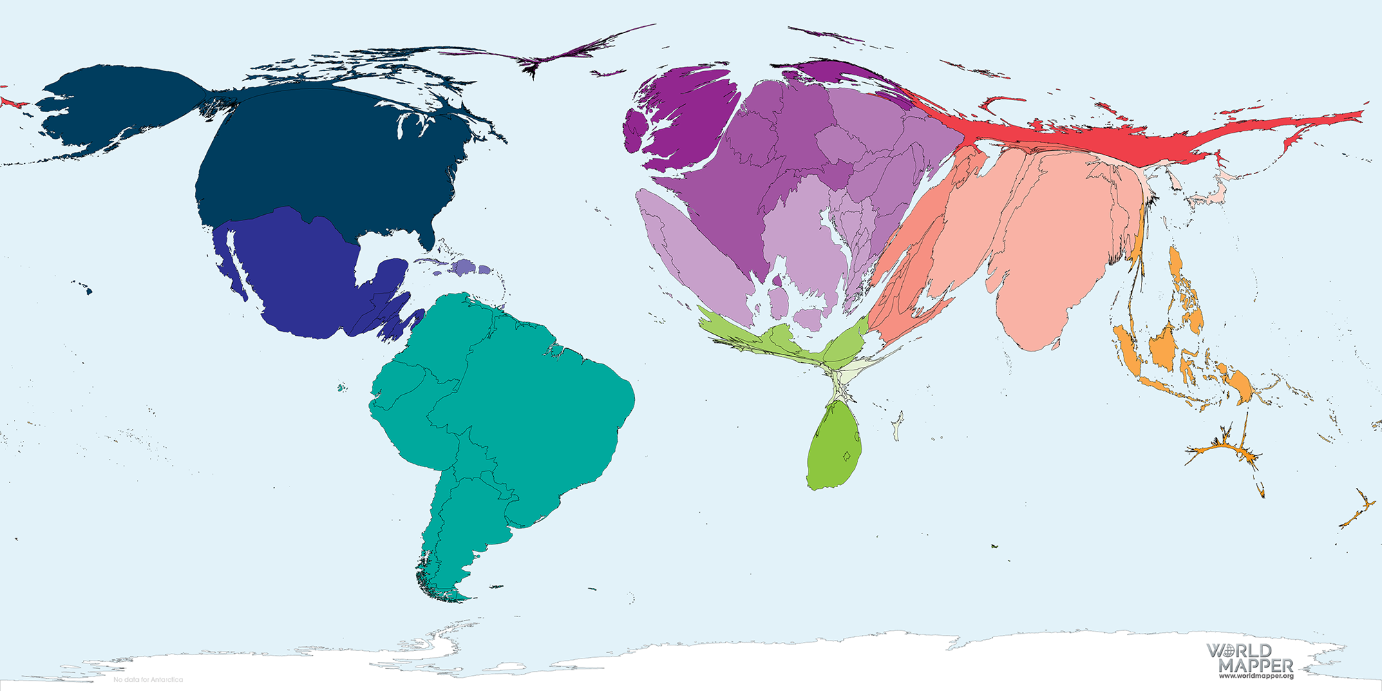
The following map animation documents the spread of the disease during the first 12 months of WHO data reporting, covering the period from 21 January 2020 to 01 January 2021. In this animation, each cartogram is shown proportional to the number of cases reported in each country. The absolute number of reported cases visualised in each map is documented in the number that is shown in the bottom left corner of the animation. Please note that loading the animation may take a moment. Due to its size, this animation takes a moment to load. An enlarged version without the red bars around it (approx. 40MB) can be viewed through the magnifier icon in the top right corner.
This cartogram maintains the same area over time, rather than grow in size. The animation shows that of reported cases, so it may reflect the places that have tests and can afford to test and choose to test, as much as the actual spread of the disease itself.
While the disease seemed contained within China over the first weeks of its existence – only few small occurrences such as in France and Germany are briefly visible – but then starts spreading towards Europe towards the end of February until two months on the cases outside China by far outweigh the ones that have been reported within China. Towards the end of April, the USA are growing in size quite considerably and turn into the new main hotspot of the epidemic. After mid-2020, growing shares of cases can also be observed in South America (especially Brazil) and Russia, followed by a growth of cases in India. Towards the end of the year the resurgence and second wave hitting Europe becomes visible by its again increasing size.
As noted in our main blog article related to Covid-19, it is important to keep in mind that the picture provided here reflects the situation as it is reported by the individual national health authorities. Case numbers have throughout the course of the pandemic believed to be higher than the reported cases, while the unknown figures may vary significantly between countries. Numbers from poorer countries, especially on the African continent, are believed to be highly underreported. This can – amongst other issues (including political ones) – partly be explained through different testing strategies.
Worldmapper.org is providing regular cartogram updates for the COVID-19 pandemic. The individual maps and situation updates can be found in chronological order in the following article:
COVID-19 (Coronavirus Disease) Update: Chronology of a Pandemic.
Please contact us if you have further questions regarding collaboration or other inquiries related to this map series.


