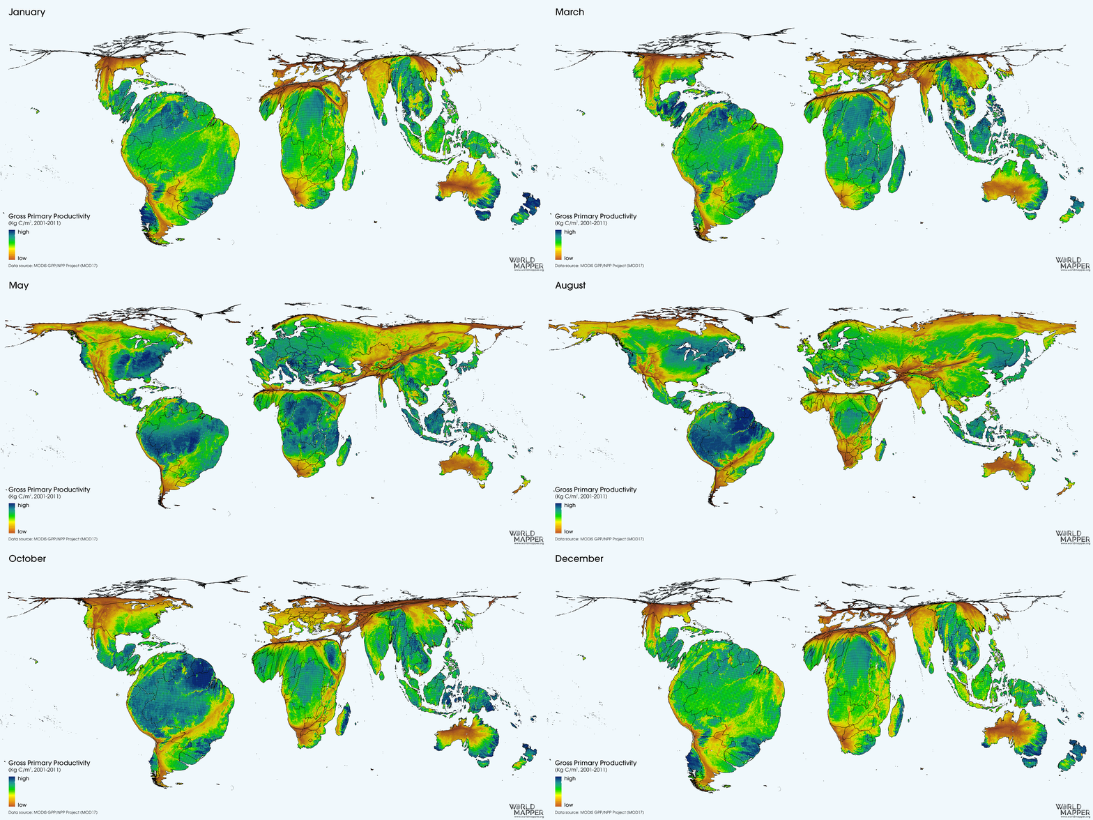
The metabolism of the terrestrial biosphere looks like nature’s heartbeat when seen through the lens of a gridded cartogram projection.

This cartogram animation uses satellite observations from NASA’s Moderate Resolution Imaging Spectroradiometer (MOD17) that is able to detect the cumulative composite Gross Primary Production (GPP) of the biosphere on land. This productivity is nature’s ‘fuel for life‘ as it gives us an idea of how the biosphere is utilising the sun’s energy to support its organisms, turning plants into the biomass factories that support life higher up the foodchain.
When and where nature ecosystems are most productive depends a lot on the time of the year. The animation of productivity shows how the changing seasons determine the variability of energy production throughout the year. Distribution of landmasses lead to the tropics being over-proportionally present in this image, especially in the northern hemisphere’s winter.
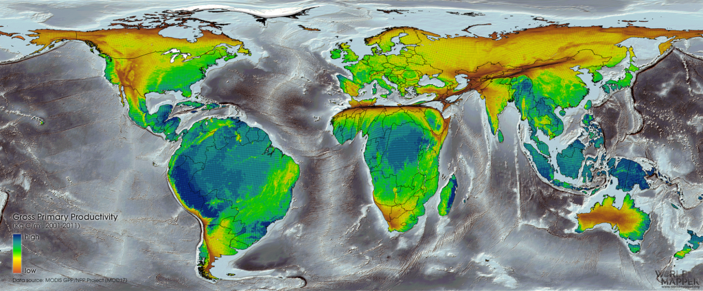
The following (static) map shows how the annual picture that emerges when adding up nature’s productivity throughout the year. Here it becomes clearer that not only solar radiation, but also other factors have an influence on the productivity of terrestrial ecosystems: Desert areas, such as Sahara or the Australian outback, remain small in this picture.

All maps above show the land surface resized according to its annual gross primary production (GPP) in terms of their carbon currency (g C m-2). Each transformed grid cell in the map is proportional to the total (annual or monthly) production in that area which is also indicated through the colours that are overlaid.
View more details about this map in the Worldmapper map library: Terrestrial Ecosystem Productivity
This map animation was created in collaboration with Yadvinder Malhi of the University of Oxford for a keynote lecture at the 55th Annual Meeting of the Association for Tropical Biology and Conservation (ATBC) in Kuching, Sarawak, Malaysia, Southeast Asia.


